
Good Vibes Andrew
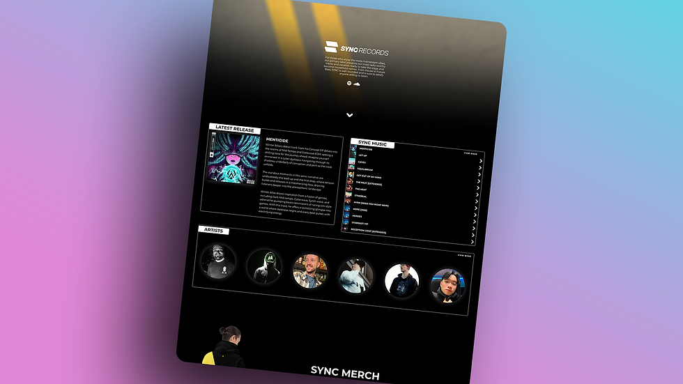
SYNC Records
SYNC Records is an independent electronic music label built to spotlight underground genres like house, dubstep, and lofi. I designed and developed the website in Wix Editor X (eventually converting to Wix Studio), making it fully responsive and dynamic with features like a rotating artist roster, album pages, and a private backend for internal operations. The brand identity draws from the gritty, high-energy feel of underground rave culture — dark backgrounds, sharp contrasts, and a bold yellow palette capture the raw intensity of the music and the DIY spirit of indie labels.

Bold, dark, and built to amplify underground sound.
This fully responsive site for SYNC Records combines dynamic content with custom branding to reflect the raw energy of the label’s electronic music scene.
Genre-focused. Artist-powered. Built for discovery.
This page pulls content directly from connected databases to showcase artists, releases, and playlists in a clean, scrollable layout. It’s designed to help fans explore specific collections of music while keeping everything easy to update behind the scenes.

A custom shop built to showcase the brand.
This fully integrated merch store was designed in Wix, complete with product filters, seamless cart functionality, and a bold, dark UI that matches the label’s identity. I also designed every item in the collection, creating apparel and accessories that reflect SYNC’s underground aesthetic.

A living archive for new drops.
This page pulls in new releases from a connected content collection, displaying them automatically as they’re added to the backend. Each album links to its own dedicated dynamic page, giving fans a smooth way to explore the label’s catalog without any manual updates.

A dynamic page system for scale and performance.
Each album page is powered by content pulled from a backend collection, allowing new releases to be added instantly without rebuilding or duplicating layouts. The design is fully responsive and optimized to look just as clean and immersive on mobile as it does on desktop, giving fans a seamless listening experience on any device.


Visuals that match the energy of the sound.
Every SYNC Records release features custom album artwork I created to capture the tone, genre, and vibe of the music. From gritty bass-heavy EPs to melodic house tracks, each design is tailored to reflect the unique identity of the artist and tracklist. The result is a cohesive visual library that amplifies the label’s underground aesthetic and gives every release its own bold presence.
MyBook
MyBook is a digital solution designed to streamline the audition preparation process for performers by organizing sheet music and audio tracks in one accessible platform. I led the end-to-end design of the website, crafting a responsive, mobile-friendly experience that reflects the app's mission to modernize audition materials. The site features custom graphics and subtle animations that enhance user engagement while maintaining a clean and professional aesthetic that aligned with MyBook's established branding.

Designed mobile-first for performers on the move.
The homepage was built with a tablet and smartphone audience in mind, prioritizing accessibility, clarity, and smooth interaction across every screen size. The layout, typography, and visuals all adapt fluidly, offering a responsive and intuitive experience for users navigating the app’s features on the go.

Support made simple, with everything in one place.
This page features an accordion-style FAQ section that makes finding answers quick and intuitive, alongside clear calls-to-action to download the app from either platform. For anything not covered, users can easily submit questions through a contact form that opens seamlessly in a pop-up — keeping the experience smooth, direct, and user-friendly.
Blue State Threads
Blue State Threads is a radical, queer-owned brand built to call out injustice and uplift marginalized voices. The site was designed from the ground up to reflect the brand’s bold, unapologetic message — with sharp visuals, custom graphics, and a responsive layout that works seamlessly on every device. A portion of proceeds from every purchase goes directly to charities supporting marginalized communities across the country, making every item part of a bigger fight for equity and human rights.

Bold visuals and interactive energy, right from the start.
The homepage highlights featured collections and recent releases while incorporating subtle motion effects and hover-based animations that react to the user's movement. These interactive touches make the experience feel alive and engaging across every device, helping the brand's unapologetic personality shine through from the very first scroll.

A streamlined shopping experience built for impact.
This fully functional e-commerce store connects directly to print-on-demand services, making fulfillment smooth and hands-off for the business while giving customers an effortless checkout experience. Products are organized by collection for easy browsing, helping visitors quickly find exactly what speaks to them.

Information that moves with you.
This fully dynamic resource hub features a scrollable list of categorized tools, links, and guides — all filterable by topic to help visitors quickly find exactly what they need. The entire site is optimized for mobile, making activism and education just as accessible on the street as it is at home.
Voyage Music Group
Voyage Music Group is a creative collective dedicated to empowering independent artists through strategic branding, dynamic content, and immersive digital experiences. I designed and developed their website from the ground up using Wix Studio, ensuring a fully responsive layout that delivers a seamless experience across all devices. The site features custom graphics and interactive elements that reflect the group's commitment to innovation and artistic excellence.

Branded, bold, and built for indie artists.
The homepage was designed to showcase Voyage’s mission with a clean layout that integrates their branding and visual assets throughout. A horizontally scrolling playlist and feature section is embedded within the full page, making it easy for users to explore releases while staying immersed in the experience. Additional sections highlight services, blog content, and more, all fully responsive and optimized for a smooth experience on mobile, tablet, or desktop.
High Risk Apparel
High Risk Apparel is a clothing brand created to help high-risk individuals communicate their need for social distancing during the COVID-19 pandemic. By wearing items like hats with clear messaging, individuals can signal to others to maintain distance, reducing the need for direct confrontation. The brand also supports the High Risk Apparel Autoimmune Fund, allowing customers to contribute to organizations that aid those with autoimmune conditions.

Clarity, accessibility, and purpose built into every click.
The homepage was designed to showcase Voyage’s mission with a clean layout that integrates their branding and visual assets throughout. A horizontally scrolling playlist and feature section is embedded within the full page, making it easy for users to explore releases while staying immersed in the experience. Additional sections highlight services, blog content, and more, all fully responsive and optimized for a smooth experience on mobile, tablet, or desktop.

Straightforward access to critical information.
The resources page was built to provide quick links to trusted COVID-19 and high-risk population resources without distractions or clutter. With a clean, split-panel layout and mobile-friendly structure, the design ensures users can easily find the information they need, whether browsing from a desktop or on the go.

Good Vibes Andrew
Web & Branding for Creatives Who Care
Located in the East Bay & Tri-Valley Area
© 2025 by Good Vibes Andrew. Created on Wix Studio.
Brighton CraftWorks
Brighton CraftWorks is a curated online shop that celebrates handmade goods, artisan craftsmanship, and original design. I created the entire site from scratch, designing the logo, building the brand identity with a vibrant color palette, and taking all of the product photography myself. The result is a clean, welcoming site that captures the warmth of the brand and works beautifully across every device.

A Colorful First Impression
The Brighton CraftWorks home page showcases vibrant alcohol ink tile art in a clean, inviting layout. A bold headline and feature tile introduce the collection with warmth and color, while a preview gallery highlights a variety of styles at a glance. Visitors can easily browse by theme, size, or color using intuitive navigation tools, making it simple to find the perfect piece. Clear buttons at the top of the page guide users to shop the collection or request a custom order, creating a smooth and inspiring shopping experience from the very first click.

A Seamless Way to Shop Handmade Art
The Store page displays a colorful collection of hand-painted alcohol ink tiles, thoughtfully organized by subject, size, and color to help customers find exactly what they need. Whether someone is searching for bold florals, calming landscapes, or seasonal designs, the filtering options make it easy to browse and shop. The layout is fully responsive and looks just as polished on phones and tablets as it does on a desktop. Each product listing includes a clear photo, price, and availability, with the option to request a duplicate if a favorite piece has already been sold.


